 My poster is about the movie good kid baad city. I made the movie headline in graffiti type to make it look related to gangs, And i also zoomed in the picture. I think one of the most succesful things in this poster is the headline and the image. The headline just fits with the movie and so does the picture. I think my tagline needs to be a little more intreging and the rating since it matches with nothing. I wanted the pictures of the actors in the original draft, but i knew that wasnt going to happen. I would have a better image to make the movie better.
The genre i will chose for my movie is comedy. I chose this genre because i like to make people laugh and i also like comedy. It will be an average african american kid growing up in a bad neighborhood. good kid, mad city. Terrance obile, chief keef, fredo santanna. I will make the poster funny and make it attarct peoples attention. I will use and image of me on the cover, and have a picture of a bad neighborhood in the background. I will take the pictures myself and create the background on photoshop. I will make it look like a good kid in a mad city. I will have a graphitti style of font. I want the the title to stand out the most. I want them to be like i want to watch that movie.
 1.Action because he is holding a gun
2. There is a shady looking guy in it A. Skyfall B. Action, Adventure C. Daniel Criag D. 2012 3. There is a guy in the front and he is in the chamber of a gun. A. A guy in a gun chamber. B. Because he wanted the poster to attract people to watch the movie. 4. Teenagers and adults 5. 007 6. It shows it is a james bond film.  My theme is a shoe based magazine and the title is jays. My magazine is shoe news and shoe products. These are appealing to shoe collecters because they want to get the best products. The images i used were pictures of shoes. I selected these images because they were relevant in the shoe magazine. I put captions on the shoes so people can search it up and buy it.
The tools i used to edit the image were the quick selection tool. The font i choose was a very bold font to appeal and standout to the consumers. The masthead is in a very bold font compared to the other fonts. I made the text in different fonts to have variety. I used the type and move tool. If i were ever do this again i would have a better background. The reason why most magazines keep the layout the same is to make their magazine more familier in the consumers mind and in turn their magazine more famous. The author identifys it in that some articles are more important than other articles in the magazine, this is to put empasis on more important articles. The reason most people would sketch something on paper is so that they will have a nice layout so it will be more refined when they have the final draft. One of the things that should be the same in every magazine is how the title will grab your attention on the most important article. The reason this component should stay the same is to mainstream the most important article in the magazine. The pictures of the headline also should stay the same to grab the readers attention. I consider this important as usually the pictures grab the readers attention not he words.

The three important elements i learned are how logo colors affected peoples emotions, how it represents the character, and how it make the person more famous. I choose obito uchia as my villain. I choose this villain because he was a hero turned villain through a tragic accident. The qualities this villain has is his pride, and it shows in his logo which is the symbol his clan has. I used a circle and cut it in half and added a small rectangle to the bottom. I used the marque tool to cut the shape and i added color to the top half. I choose red and white since that is the color of the uchia clan. The color scheme reflects the villain because this logo represents a power hidden in his eye. I used put the name of my villain in the middle to show he is apart of the clan. The marque tool, the type tool, and shape tools were very helpful. I use the type tool for the words in the center, the shape tool for the circles, and the marque tool to cut the shape in half. If i were to do this again i would make the words stand out more.
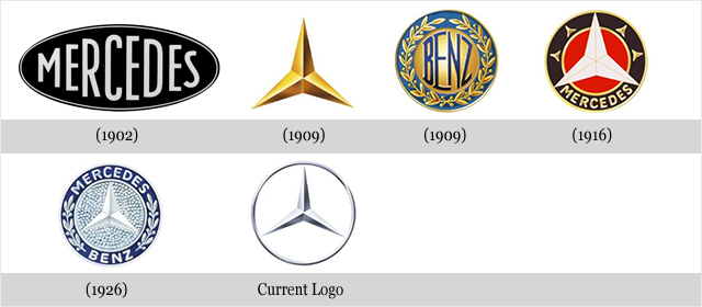
The logo i choose was the mercedes benz logo, I choose this logo because i have a mercedes benz car. I like the shape, symbol, and color because its shaped like a star which i find attention grabbing, it is a symbol of a star which is cool, and has a silver color which is attention grabbing. It was the big curved words that made it stand out. The logo changed from words to a star, the logo isnt as colorful, and the logo is more simple. I would add more detail to the logo since it is luxury cars.
|
|


 RSS Feed
